What is Color Theory, and how does it affect your art?
What is Color Theory, Really?
It's a simple question, but the answer? Not so simple. In simple terms, color theory is the study of how colors interact with one another, both as viewers or artists! It's the system behind the way we mix, match, contrast, and pair colors to create our art. whether that’s something that is calming, chaotic, moody, vibrant, or anything in between.
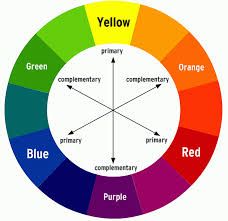
Think of it as the science and art behind choosing colors. It gives us tools like color wheels, complementary colors, analogous colors, warm vs. cool tones, hue, saturation and values. And yes, you're probably thinking it's complex. Even for those of us who use it all the time, it can still be tricky. But here’s the truth: no one is born a master of color theory. It’s a skill you can practice and grow over time.
Why It’s So Confusing (But Also Kind of Magic)
Let’s be real, color theory can mess with your head a little. You might pick a color straight from a tube or a digital palette, but once it’s on the canvas (or screen, or paper), it suddenly looks different? That’s because colors don’t exist plainly, they’re always being influenced by the colors around them. One color might pop when placed next to its complementary color, or it might look totally dull when surrounded by similar tones. This is what makes color theory so cool and so powerful! It lets us play with how people see and feel our art.
Can Color Theory Be Used in Other Types of Art?
Absolutely. It’s not just for painting! Whether you’re into digital art, graphic design, sculpting, crafting, or even interior design, color theory still matters. Anytime you’re choosing or working with color, you’re engaging with color theory, whether you realize it or not.
How Does Color Theory Affect Our Art?
Color theory can truly make or break your piece. It’s what helps an artwork feel balanced, emotional, and impactful. It guides your choices so you’re not just picking colors randomly, you’re using them to tell a story. Want to make your viewer feel warmth, love, or anger? Lean into warm tones like reds, oranges, and yellows. Trying to create a sense of calm or mystery? Cool colors like blues and purples might be your best friends. Want to shock or captivate someone? High contrast and complementary colors can do the trick. When you start to understand and feel how colors interact, your work starts to shift. You might start noticing how a tiny tweak in saturation or a small shift in hue changes everything! And that’s when things get fun.
Final Thoughts
Color theory isn’t some scary concept, think of it like a toolbox. A super useful one, at that. And the best part? It’s something you can grow into, experiment with, and make your own. So don’t stress if it feels a little overwhelming at first. Every artist has been there (I know I have). The more you use it, the more natural it becomes. Who knows? Mastering a little color theory might just lead you to your best piece yet.
From your favorite artist,
Isabella X Hernandez